I re-designed a mobile checkout flow to improve conversions I did this for tripBookr In 2017
I have been working as a UX / Product design consultant for tripBookr since the relaunch of their site in 2016. ( I also did their re-branding and initial site redesign ) For this particular project, tripBookr had integrated with Wego (a third party travel aggregation site) 6 months before I was called in to consult.
I was bought on to help improve the user experience of finding and booking a hotel room with tripBookr (on the Wego platform) after they were receiving much lower conversion rates than expected.
Current Wego app user base. Searching for the best deals on luxury hotels.
UX & UI Design - Working remotely with tripBookr engineering and marketing team on implementation.
Ideally, we would have AB tested the new flow with a 50 / 50 split, but due to technical / design constraints of integrating with a third party app, we were unable to do so.
• Studied the user session recordings via Hotjar.
• Researched the search/refine/purchase flow of competitor providers on the app.
• Researched the patterns used by competitor sites on desktop, mobile and native app experiences.
• Presented my hypothesis and wireframes for the revised checkout flow.
• Create a prototype in InVision to observe test users completing the search / refine / book process with the new flow.
• Work with development to implement.
• Reassess conversions in 3 months time.
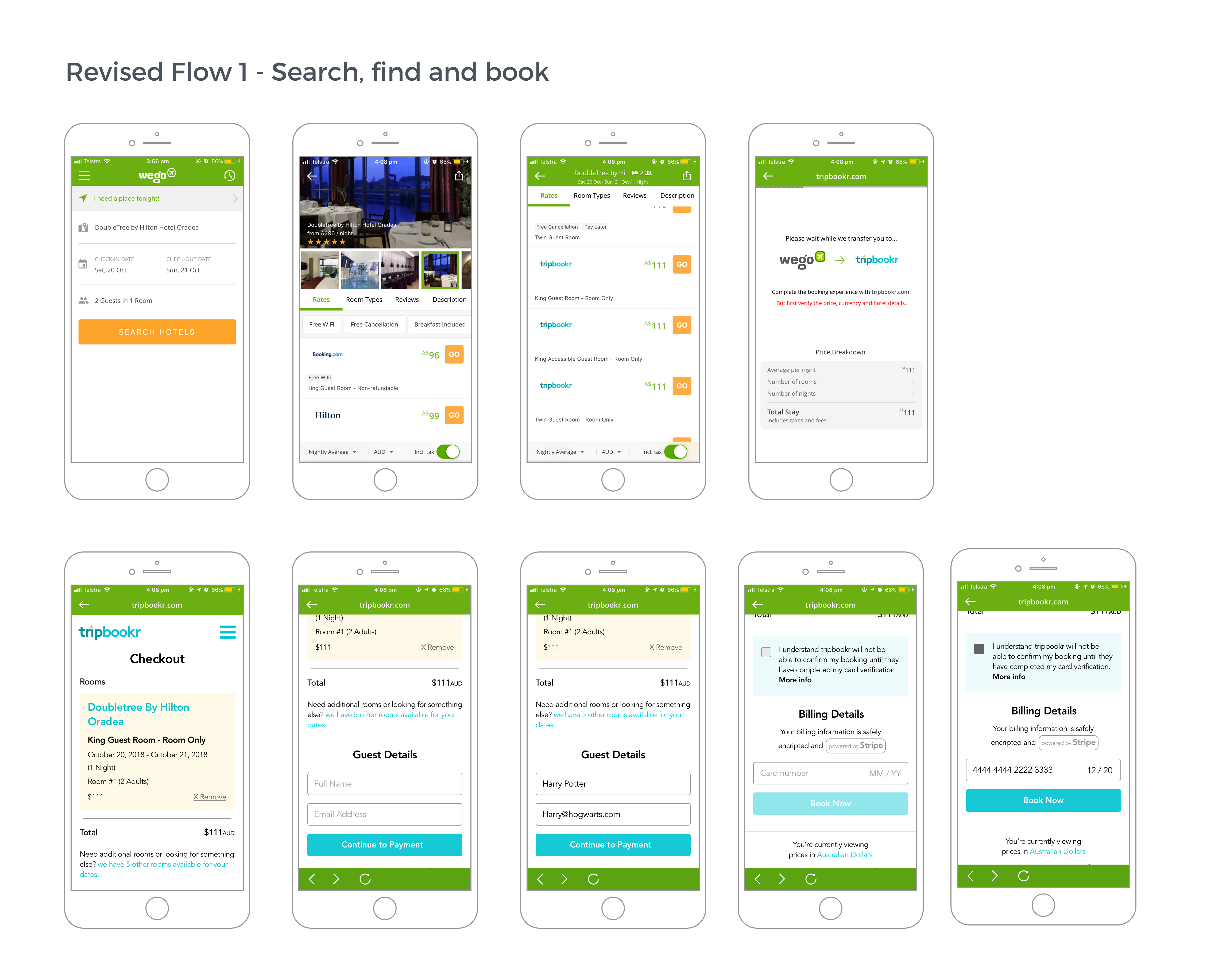
After reviewing the Hotjar recordings and completing the search/refine/book process for tripBookr and a competitor provider within app, I identified a roadblock where we were making the user select the room type twice.
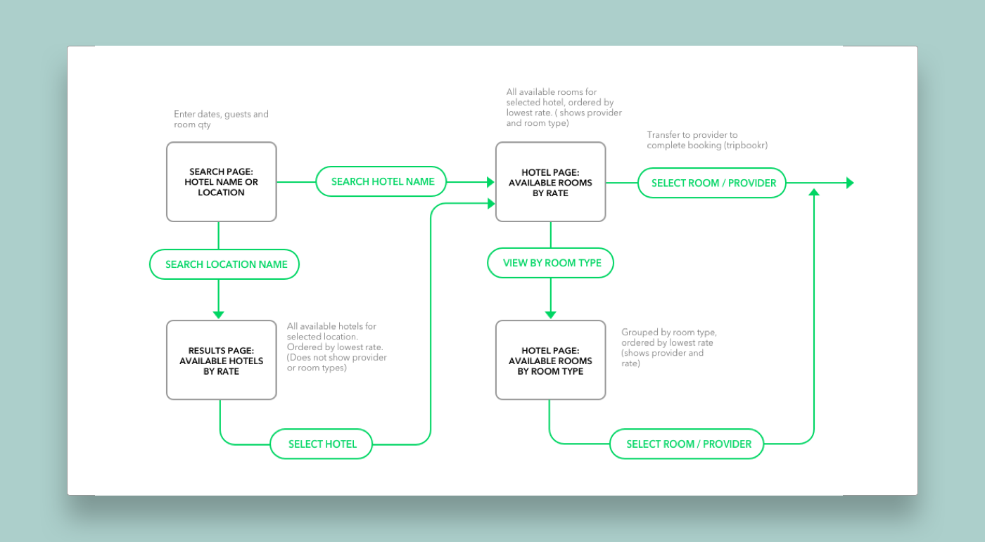
When searching for a hotel name directly, the default app results listed the cheapest rates for any room type or provider, with the option to also view results specifically by room type.
When a user clicked through the result they were transferred to the booking provider to complete the purchase where we were not pre-selecting the room that they had already clicked on; but instead, landing them on the hotel listing page and making them select a room again.
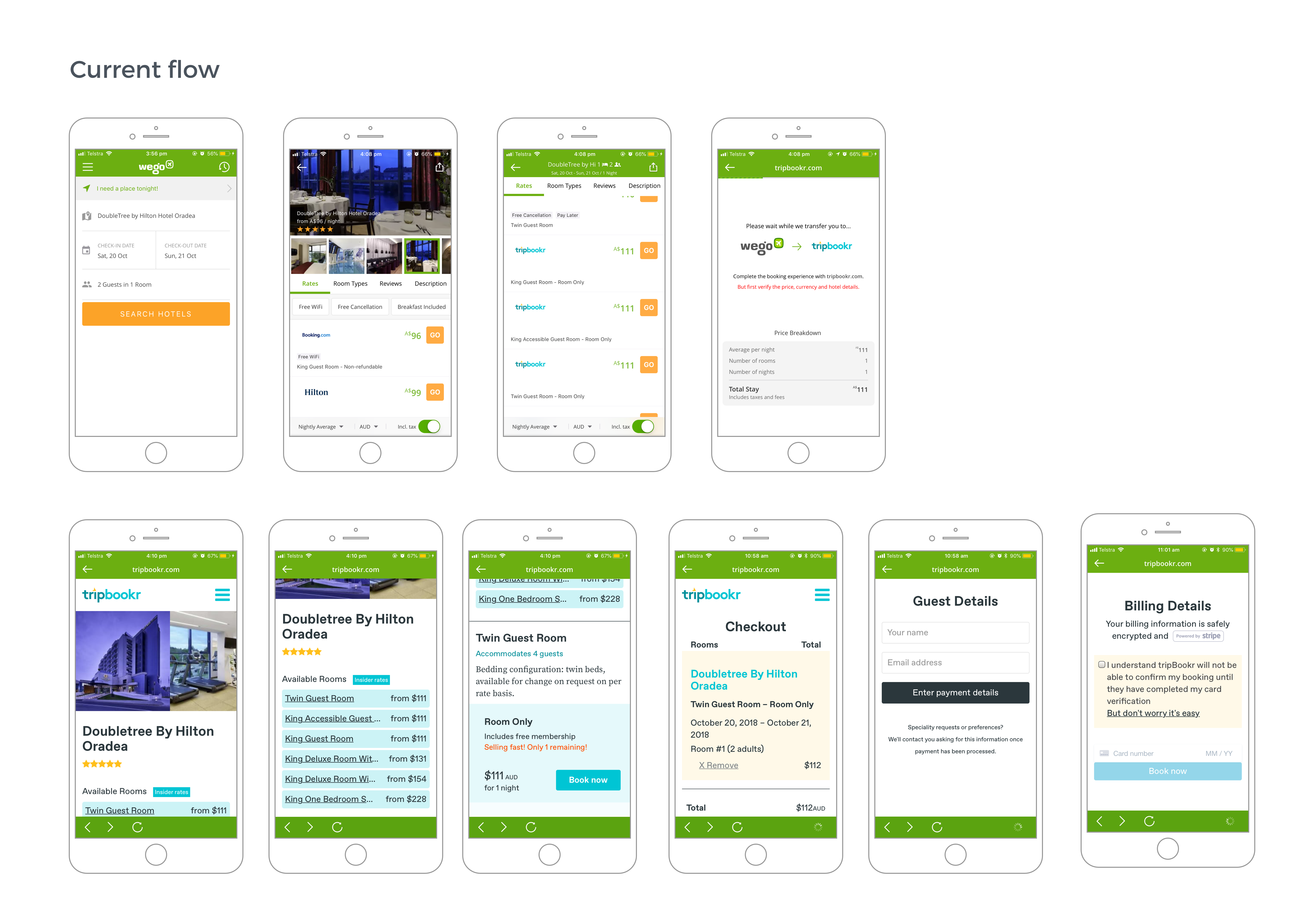
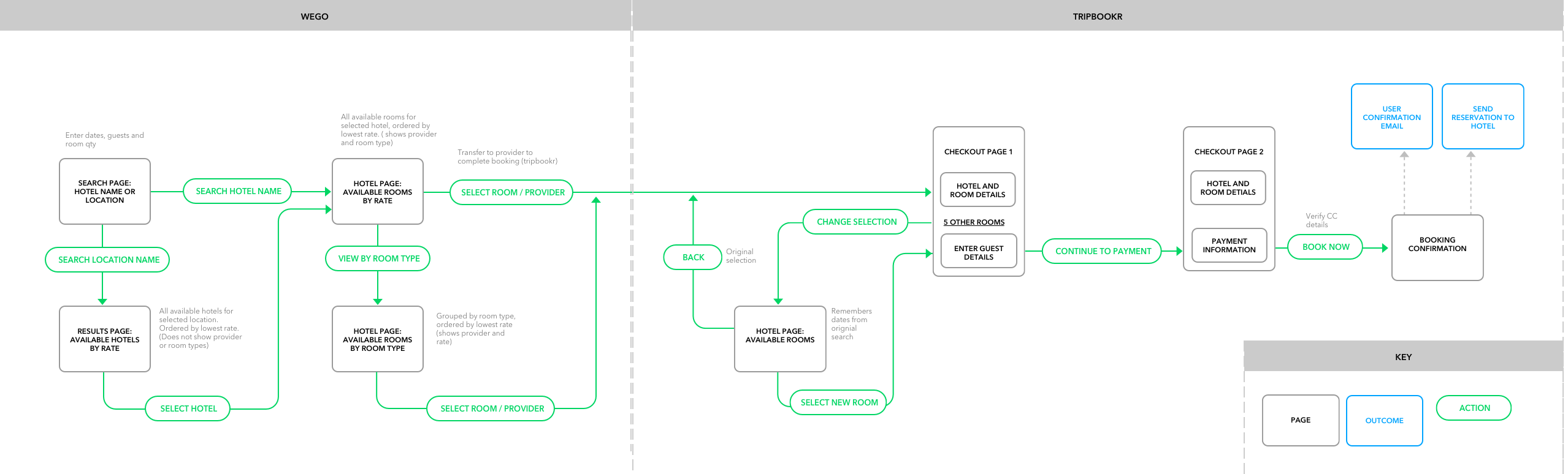
After reviewing other sites that worked similarly to Wego, (where research and refinement happen on one platform and booking and payment with the provider ), I proposed the solution of taking the user straight to the tripBookr cart page after clicking on the chosen result on Wego. We would support this with messaging in-app “Please wait while we transfer you to complete your booking with X” This would eliminate the friction of reselecting a room and allow for a streamlined 2 part checkout.
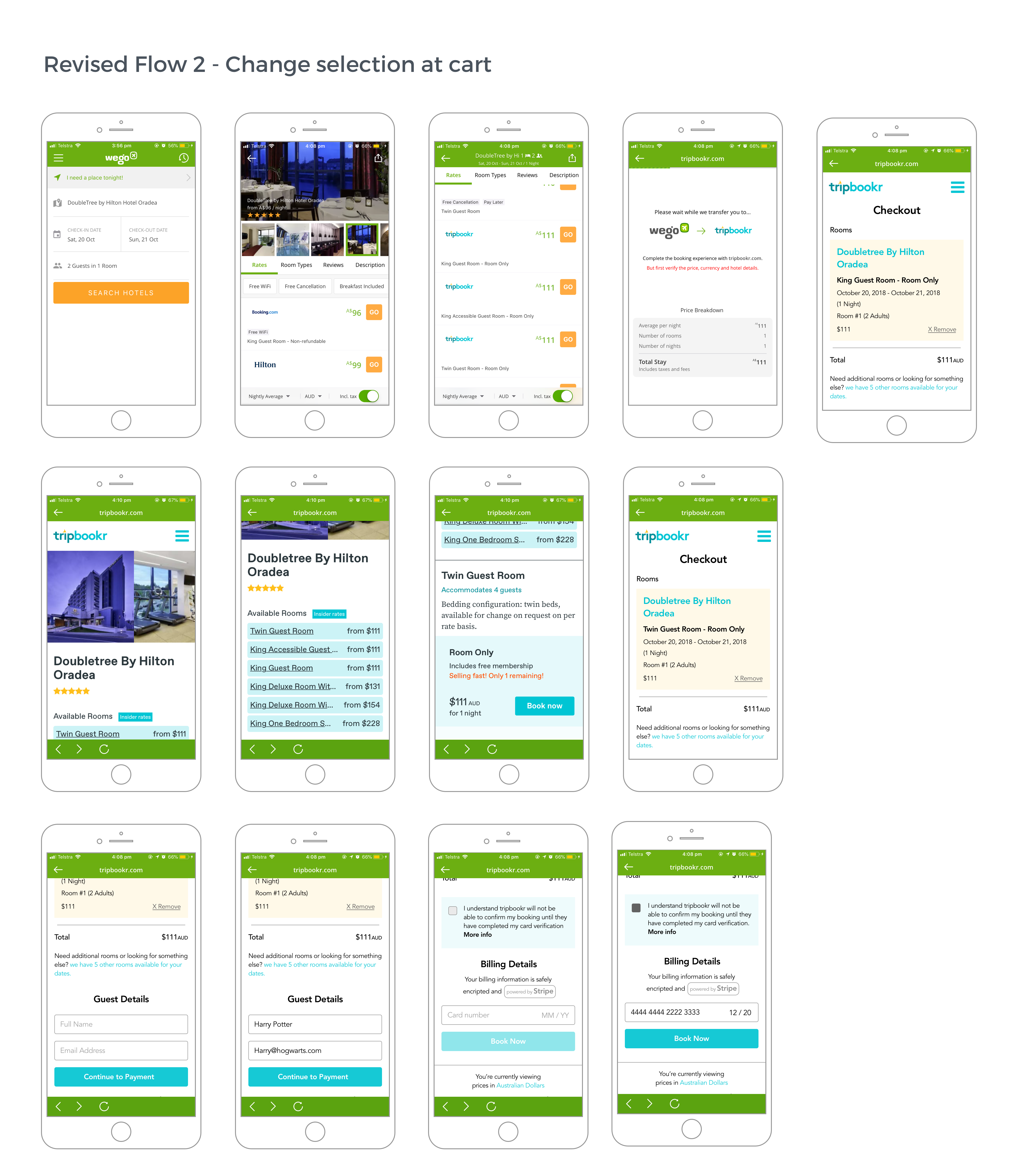
On the cart page, I included a link back to view other room types affording the user to change their mind and select a different room if they so chose (within the context of tripBookr)