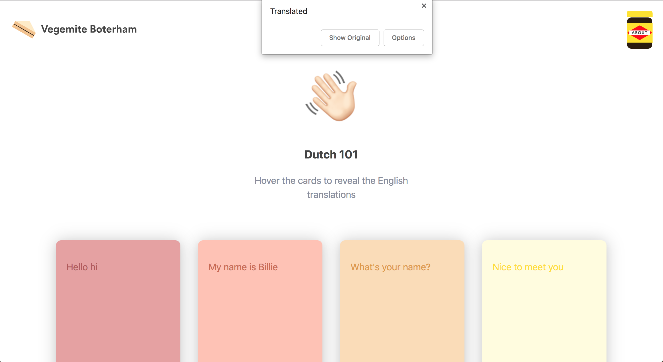
I designed and developed a website To help me learn Dutch I did this for myself In 2018
In the lead up to moving to The Netherlands, I was learning Dutch via the Duolingo app. I wanted to create a fun site to help reinforce the learning of some basic phrases that would come in useful when I hit the ground. Why the name? Boterham means sandwich, + vegemite = Vegemite sandwich. Seemed fitting.
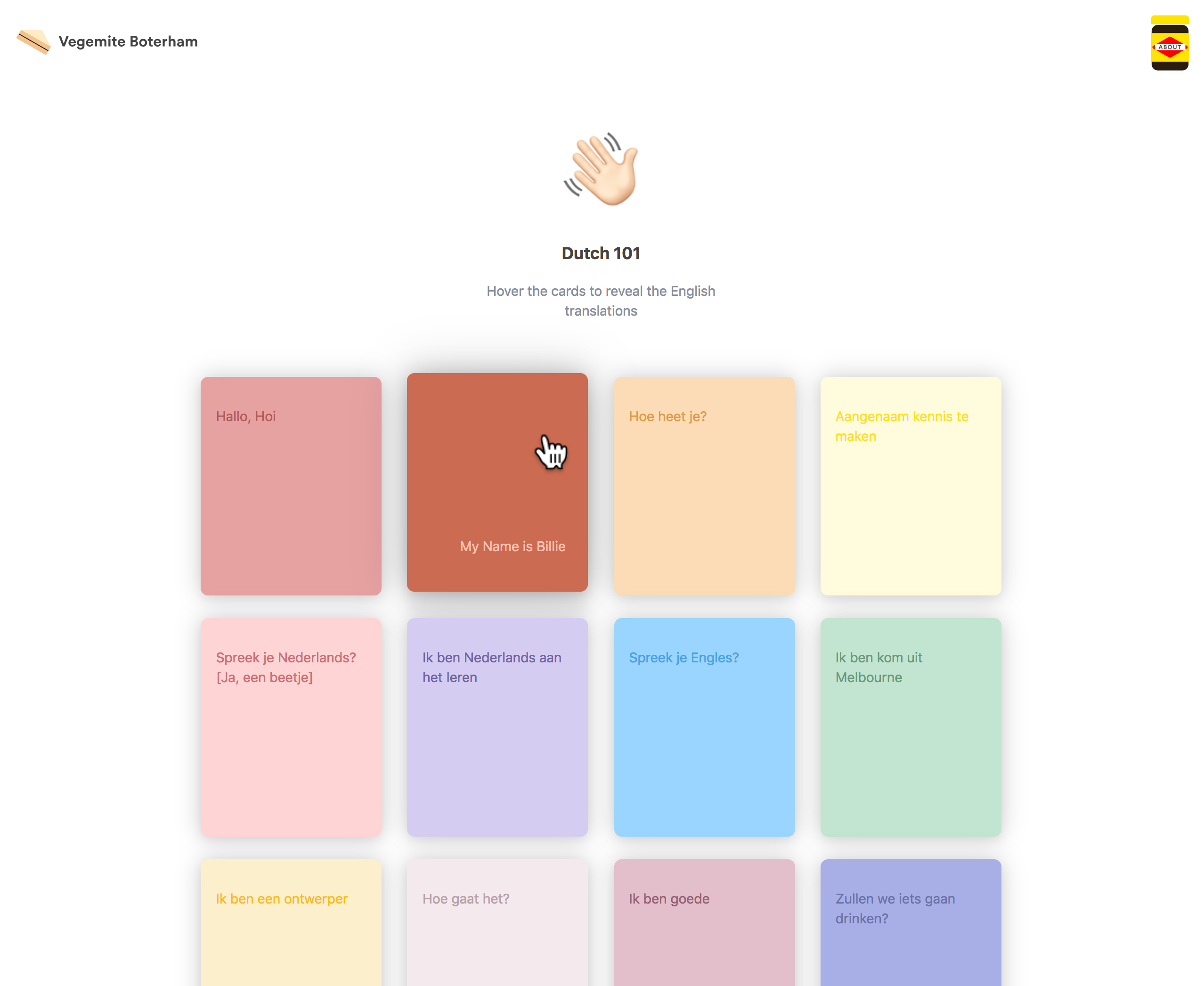
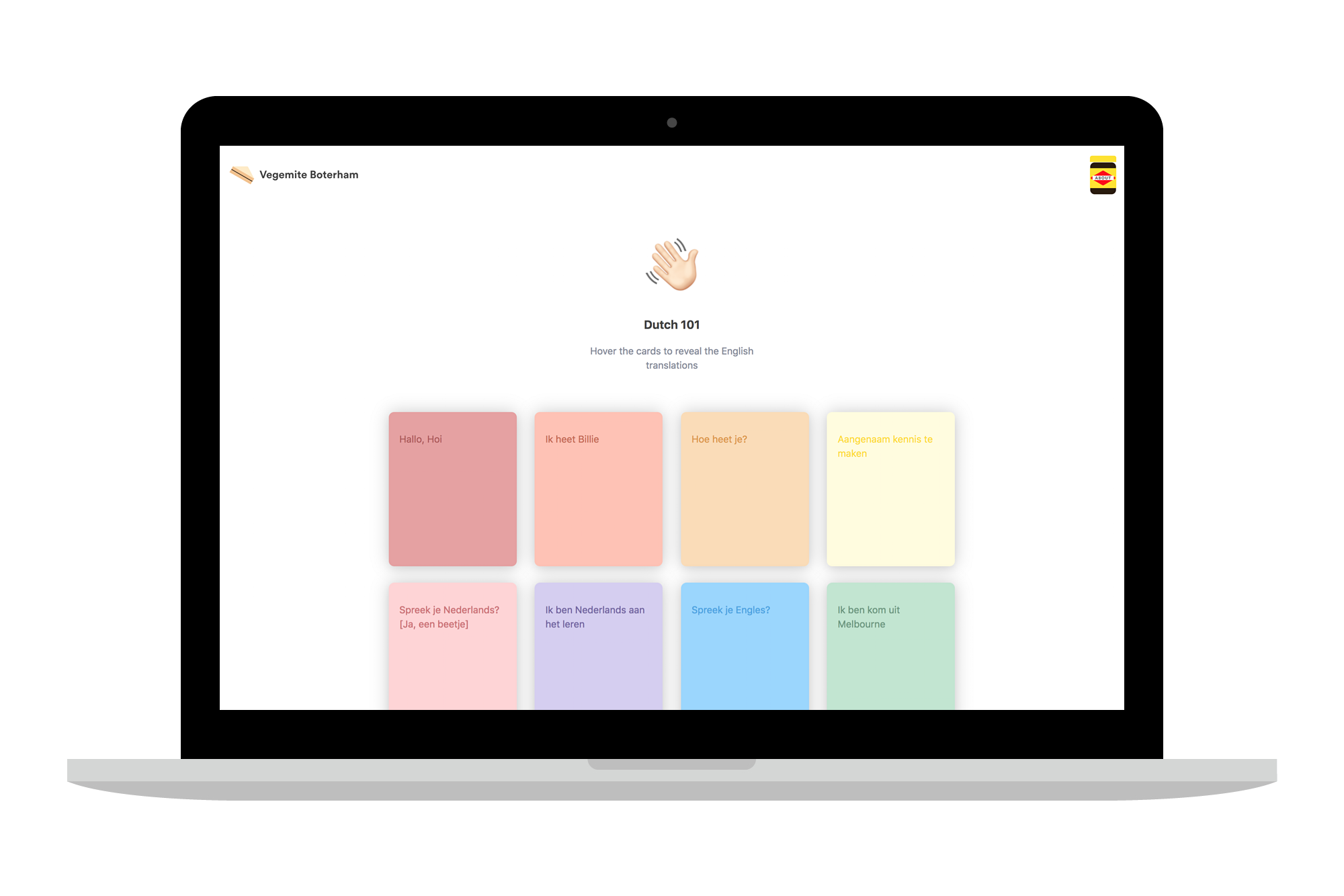
I had an idea in my head, something super simple and slick with a hover reveal for the English translation. I wanted to see if I could build the whole site with CSS only and use fun colours to reinforce the memory aspect of learning (vs an all white card layout).
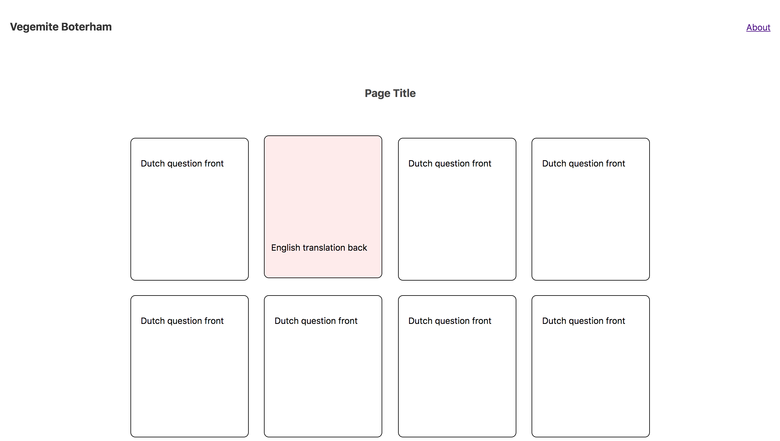
First I created a simple prototype to get the basic site layout and test the interaction / reveal feature in CSS.
I started listing a bunch of questions and statements that I thought would be useful in a general "im-new-here" interaction. I edited it down to a reasonable 20 that I wanted to practice and made sure they fit the layout and flowed like a real conversation.
With the colours, I needed to ensure the neighbouring cards or hovered backs wouldn’t clash or look too similar and that the text was legible.
Once I was happy with the colours I exported the screens to Zeplin which has an inbuilt styleguide view with the colours pre-formated into CSS variables.
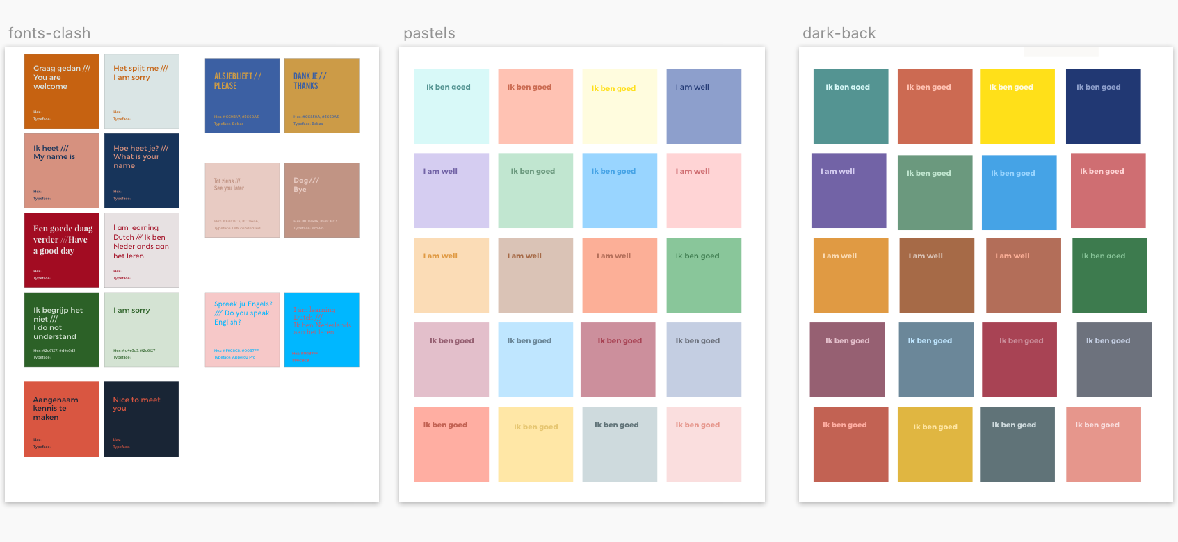
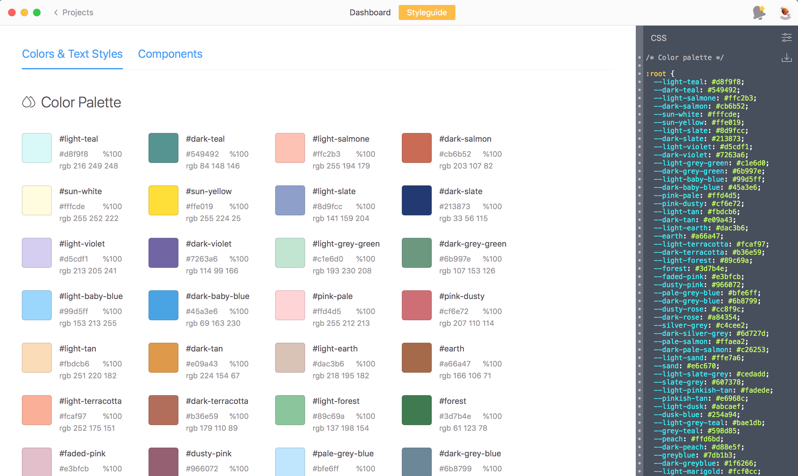
The part that actually took me the longest was choosing a mix of colours that all worked harmoniously in a big picture... and weren't ALL pink.
Also, the thing about developing in Chrome was every time I refreshed the page it would automatically translate. Super annoying and defeated the whole purpose of the hover reveal. I fixed this by a simple line of code in the head which blocked the default translation action.
Overall I'm happy with the site and it was a fun project to work on and push myself to create something with lots of COLOUR.
Initially, I had wanted to try and use CSS only, however the nature of hover interactions and mobile = no bueno. I thought about where I would be using this most (on Mobile) so I ended up having to use a small bit of js to mimic touch hover on devices.