


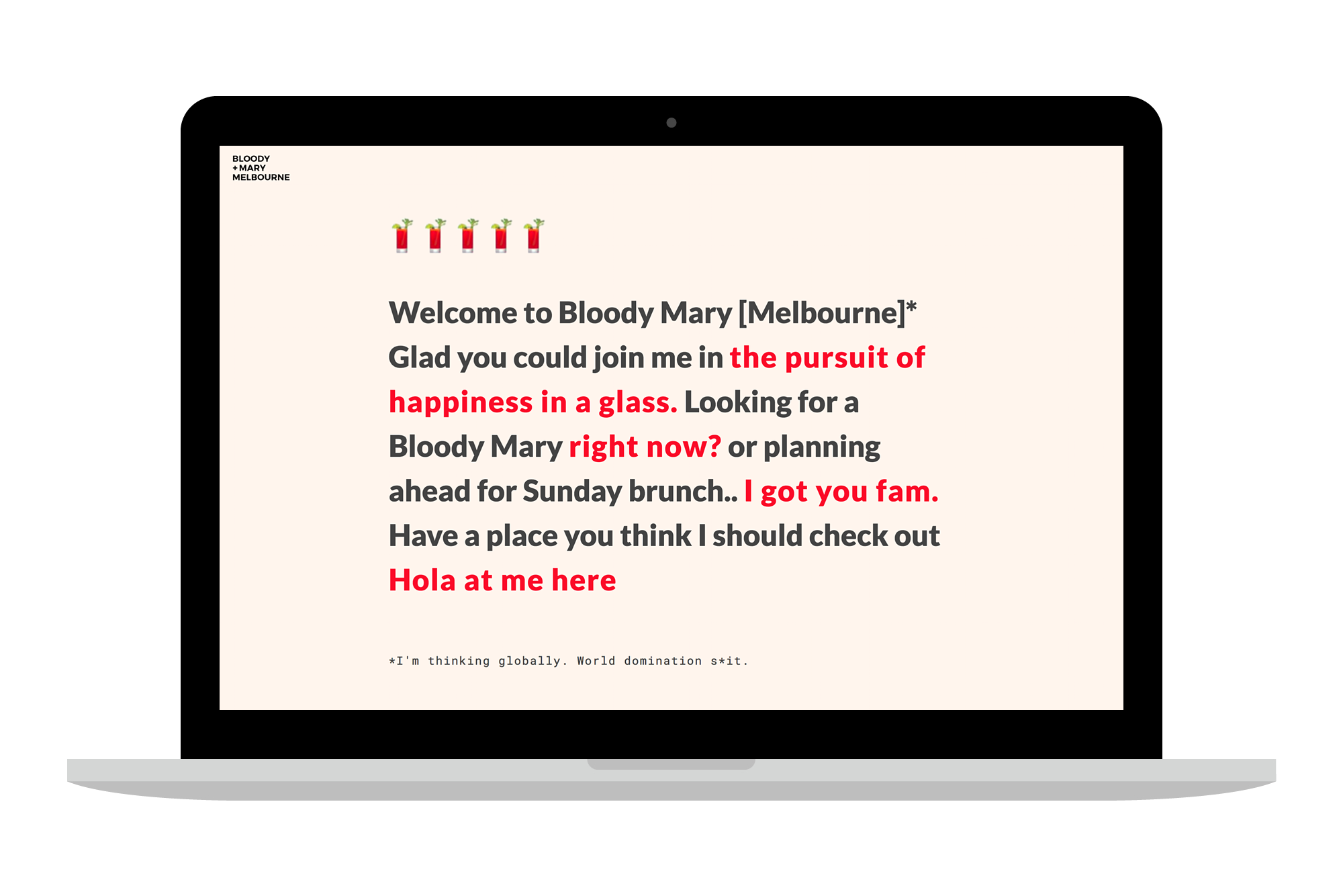
I Re-designed a Bloody Mary review website To simplify updates and focus on the big picture. I did this for Fun in 2018
Originally created as my final project for the General Assembly Front End Web course (2015). I ambitiously decided to design and built a Bloody Mary review website. The site has seen a couple of redesigns over the years, but the primary focus had been growing a social media following and updates to the main site were not being made as often as they should.
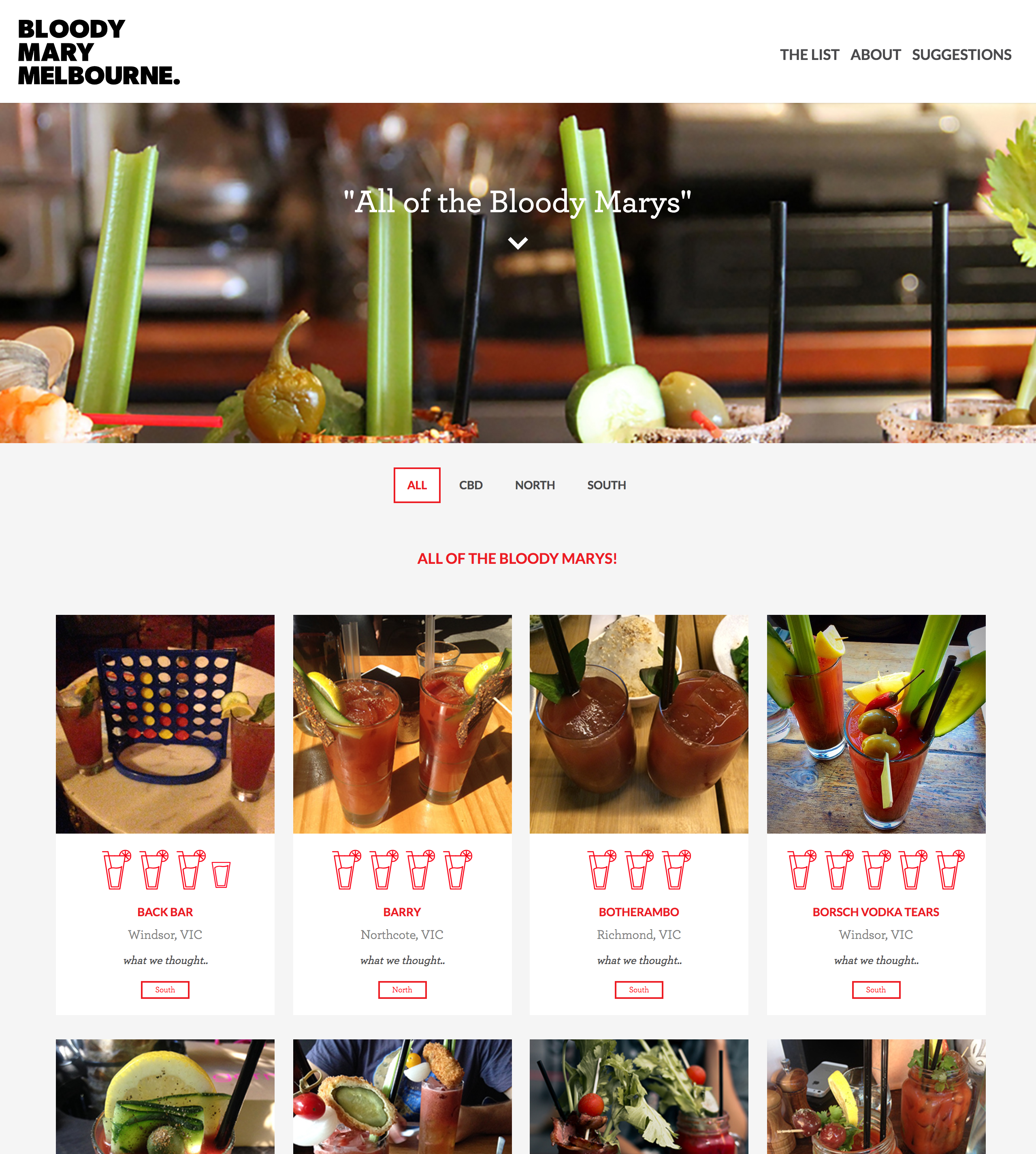

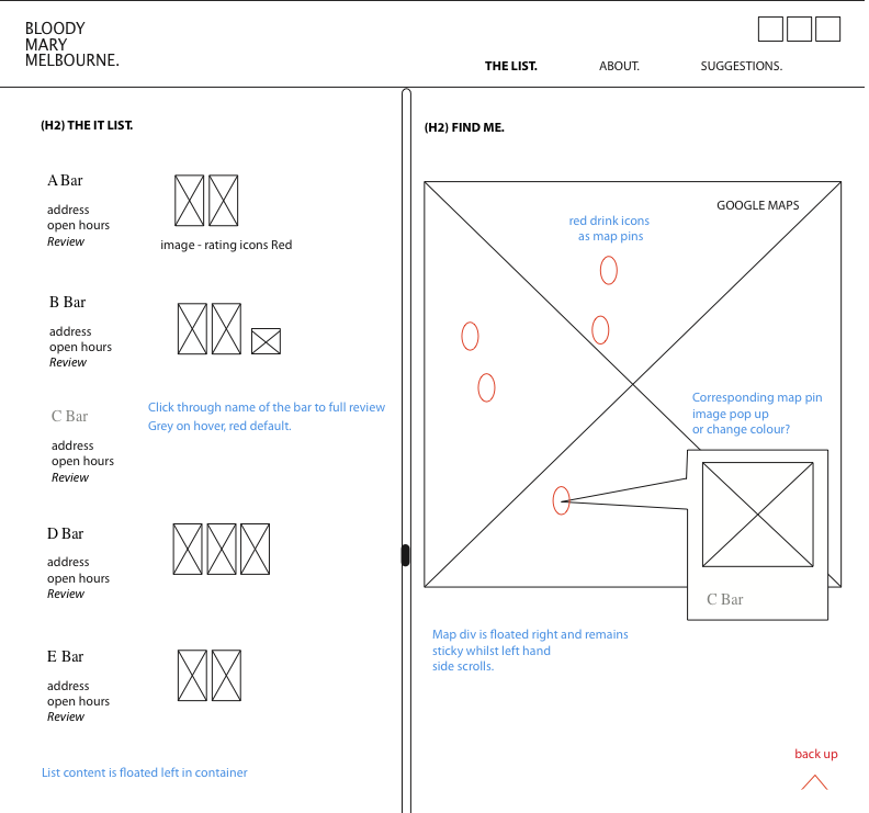
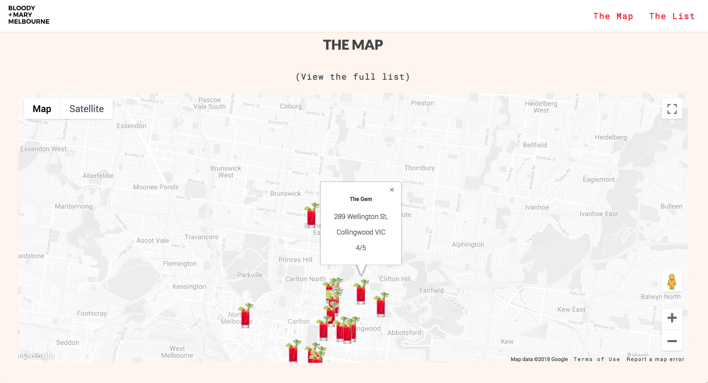
For the original class assignment, I wrote the responsive layout from scratch and included google maps with custom pin locations and individual review pages. I later re-visited the site and moved it to Bootstrap-3 allowing for easier layouts.
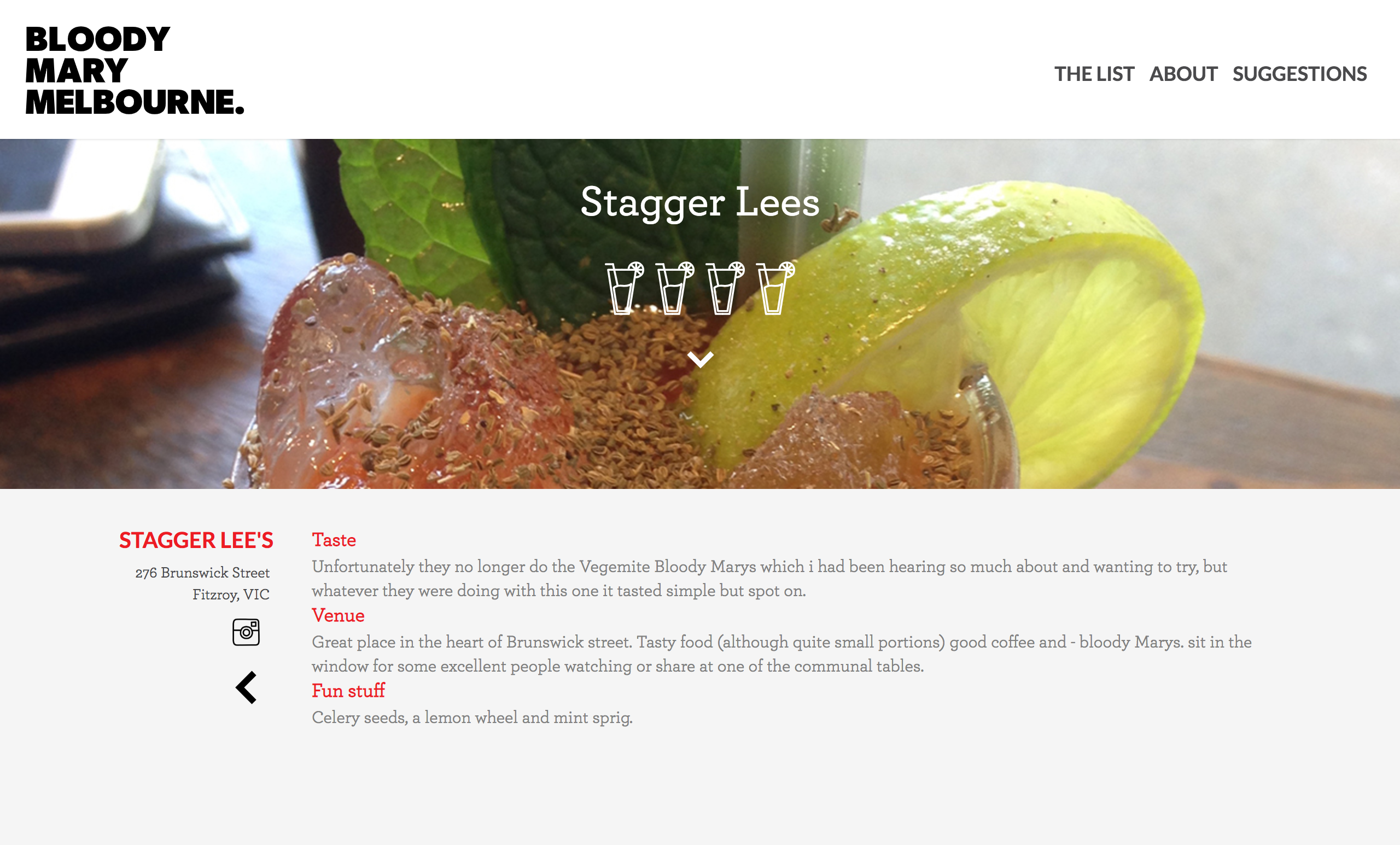
My biggest issue with the previous design had been lack of regular updates. The site relied heavily on venue "reviews" which were initially all handwritten HTML files. This was never going to be scalable as I had to manage a text file of notes from each place I visited as well as images which needed to be resized and managed for each venue.
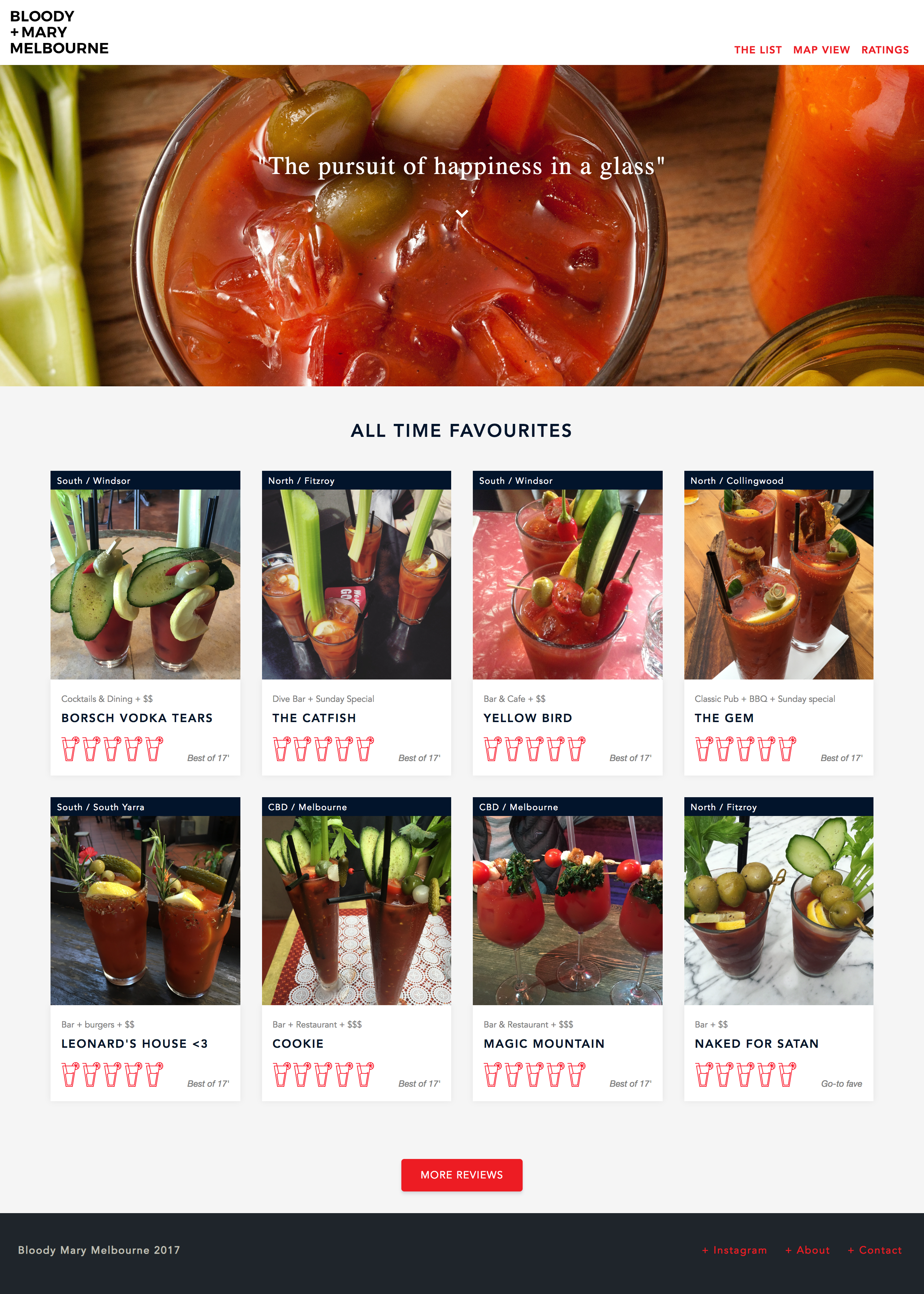
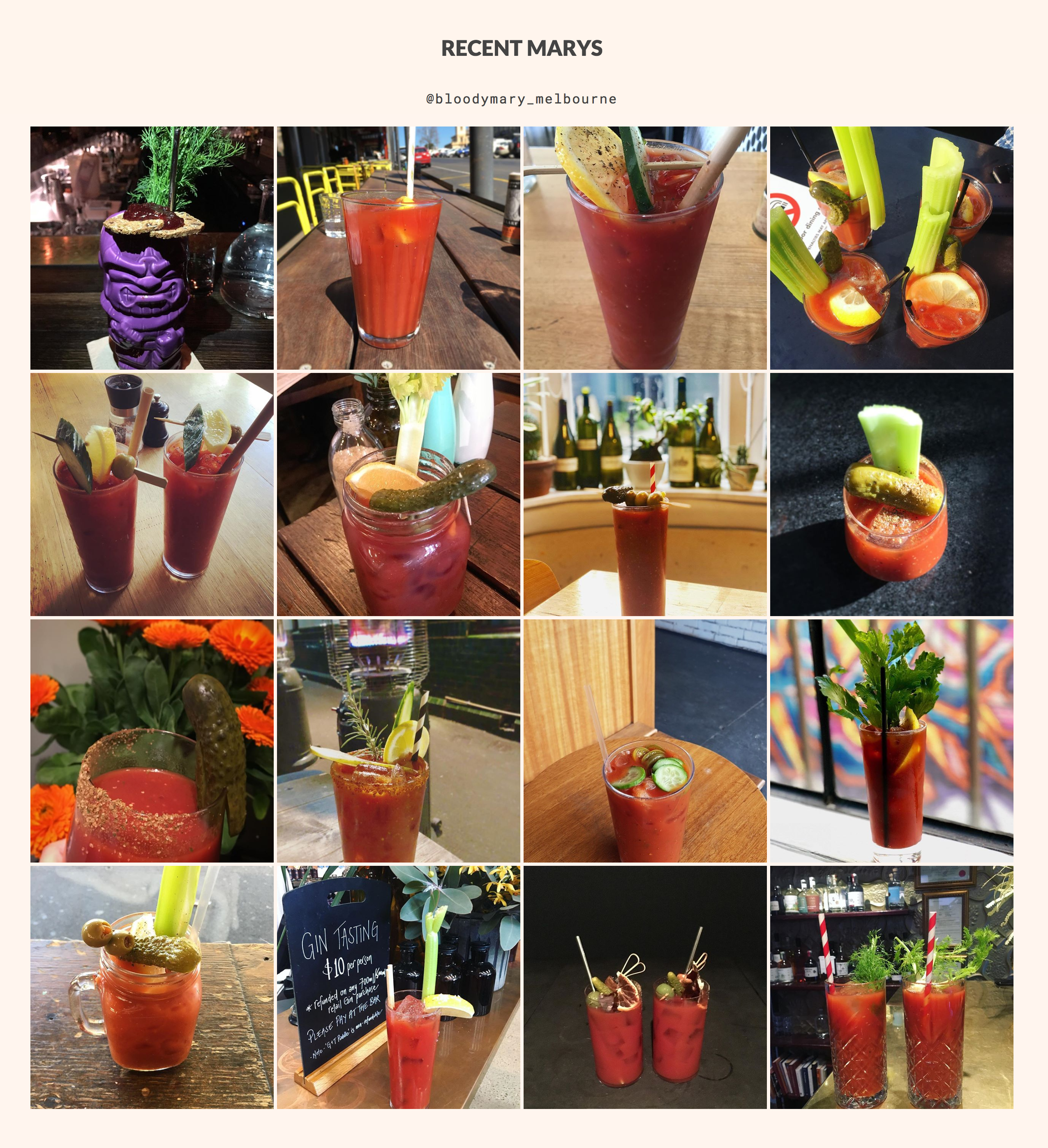
The goal of the latest redesign was to strip back the site to the bare minimum while deciding what I want to do next with it. I did this by removing individual review pages, simplifying the directory listings and including an Instagram feed on the home page so content would still be updating. I also made the decision to remove Bootstrap-3 and re-write the whole site using flexbox.
Writing each individual review out by hand as a single HTML file was not scalable, but without them, the site feels too simple. In the not too distant future, I aim to completely re-build with a CMS where I can make updates easier. Eventually, I'd love to have crowd sourced reviews and ratings and have been in talks with various places to do a Bloody Mary ready-to-drink collaboration.