


I Re-designed a digital product dashboard UI To Help users find and feel confident in configuring app settings. I did this for Chatlio in 2019
Chatlio is a Slack-based chat widget that allows operators in Slack to talk to visitors on their site via a simple embeddable chat widget. (Like the one on this site!)
With an upcoming release of a new product and a recent update to the customer-facing site, they were wanting to improve the usability and look and feel of the existing app dashboard to maintain consistency and ensure future scalability.
I was engaged to perform UX analysis of the existing app configuration interface and propose an updated UI design with the aim to improve overall usability and scalability.
Success would be defined by: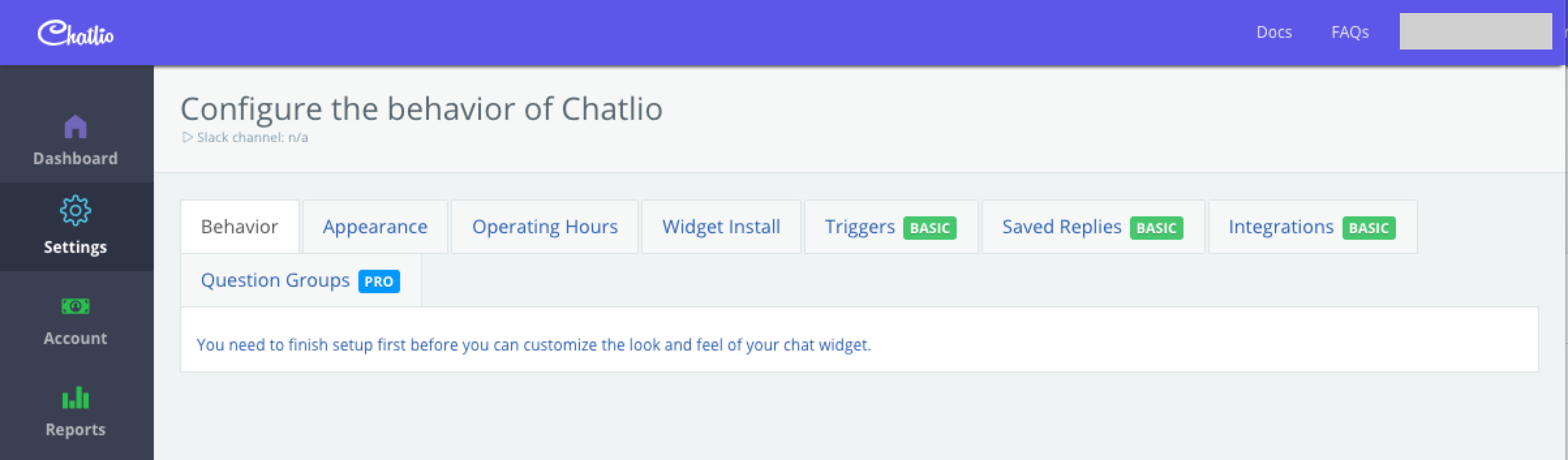
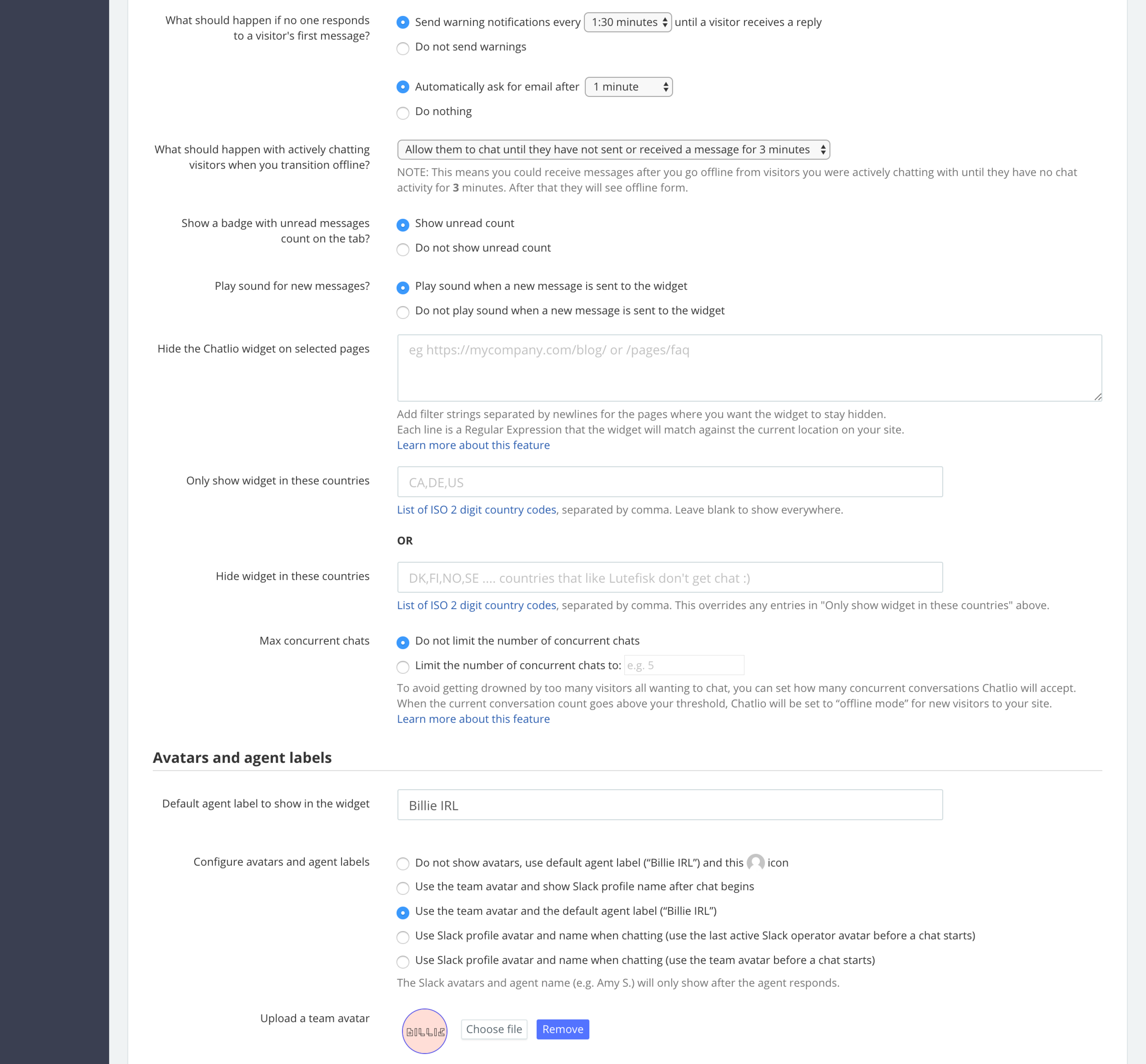
The product was nearing 3 years old, and the app configuration settings dashboard looked dated. As features had been added over time, the existing tabbed UI had begun to wrap, and complex configuration settings were included on long forms with no clear grouping, navigation or easy saving actions.
For this project I worked in a remote team of 3, consisting of UX/UI
design (Me)
a front end developer and customer sucess lead.
Simplified steps of how I approached the problem
1. Perform heuristic analysis of the existing interface
2. Process user feedback/reviews from recent testing (Completed before I joined the project)
3. Present findings from the analysis
4. Create lo-fidelity wireframes with proposed improvements (2x options)
5. Create mid-fidelity prototype with preferred layout
6. Test prototype (inVision) with existing dashboard users (Technical support team)
7. Implement feedback and produce Hi-fidelity design for handoff
8. Work with engineering to implement and test
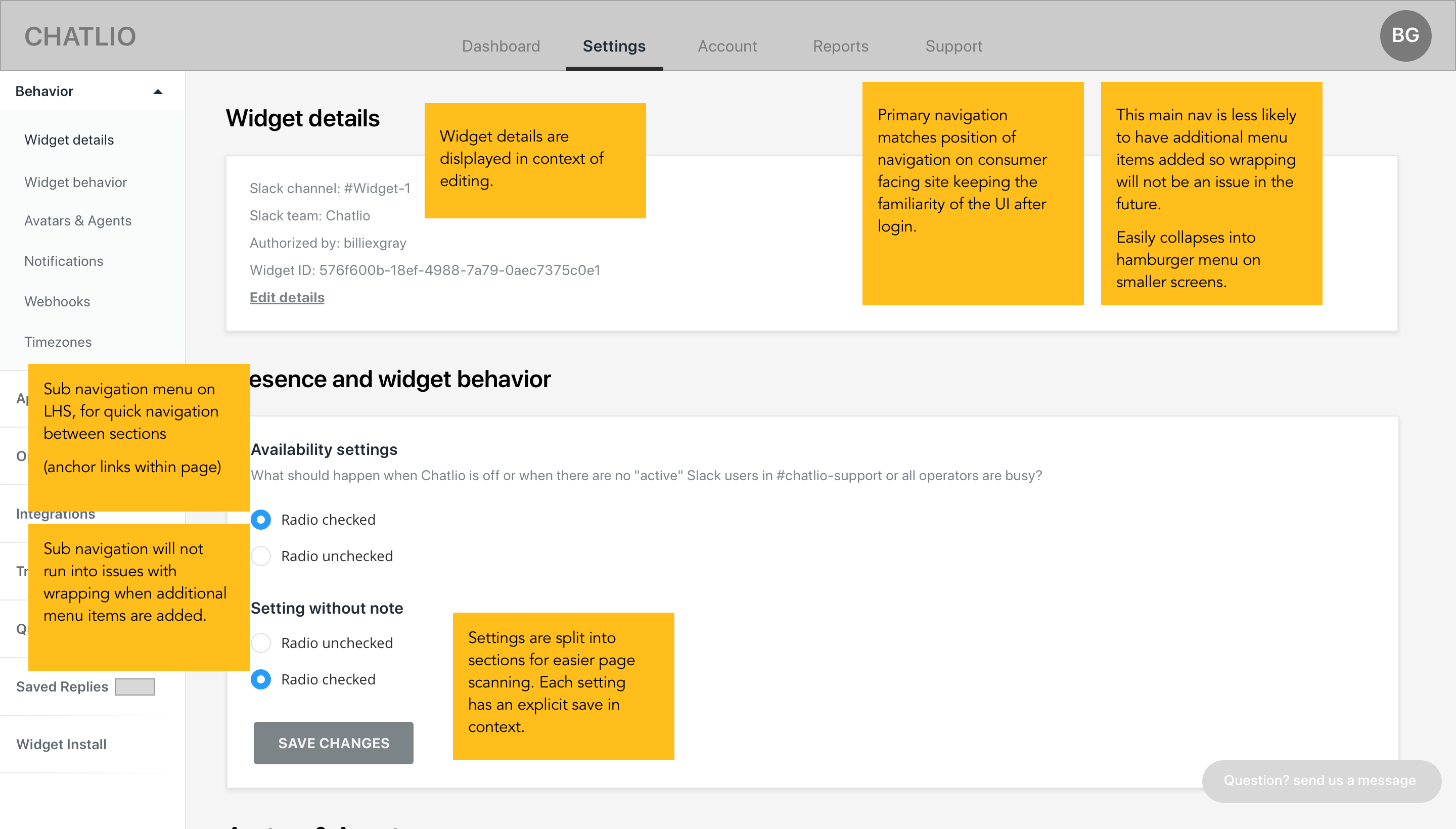
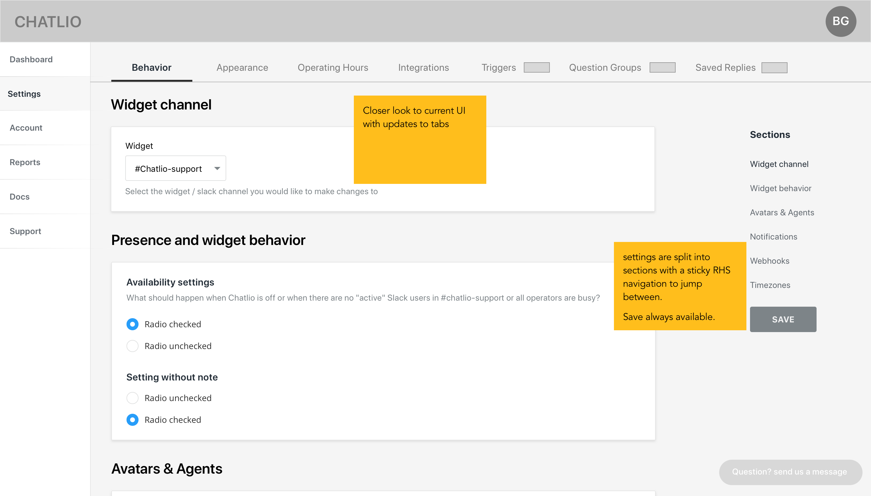
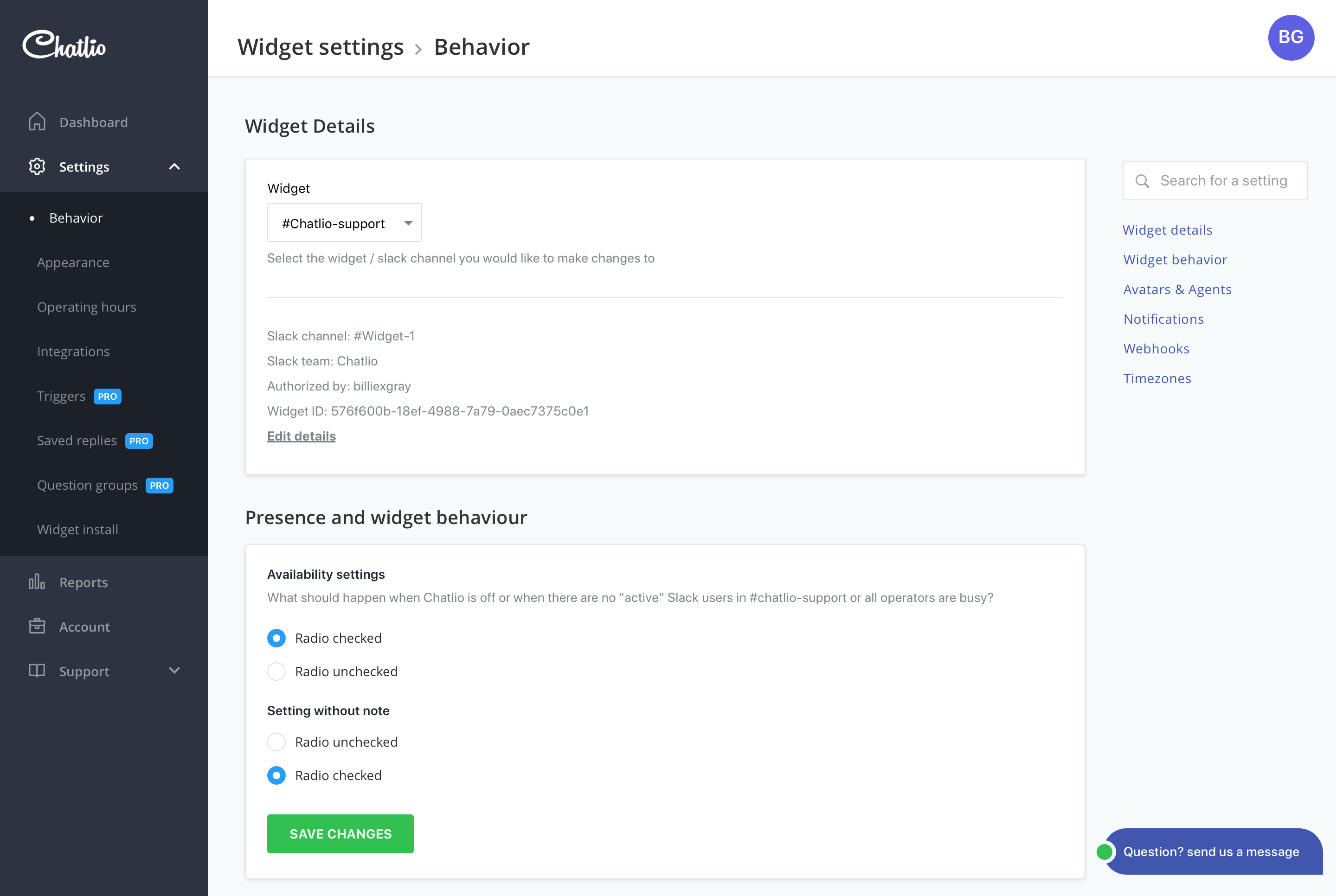
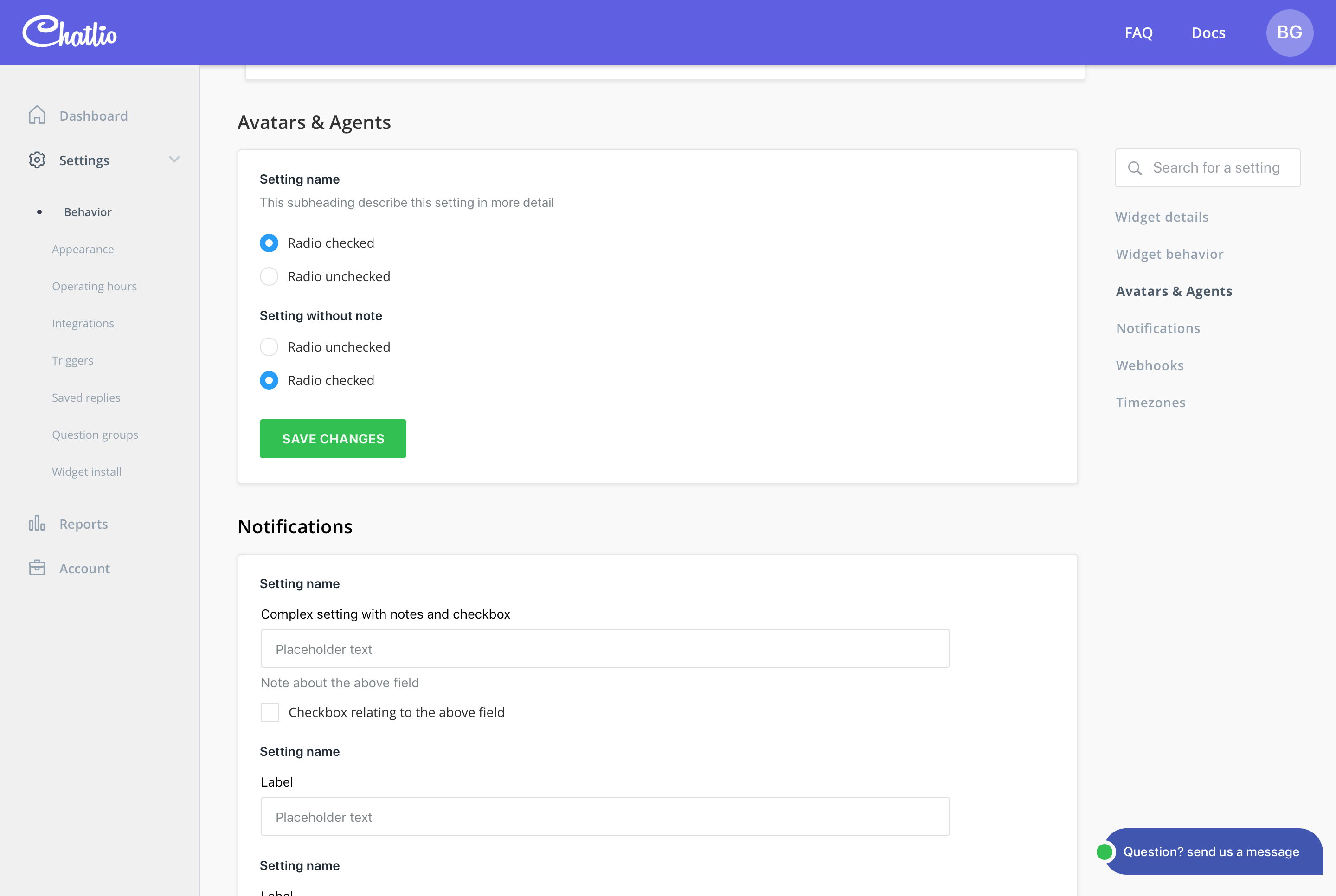
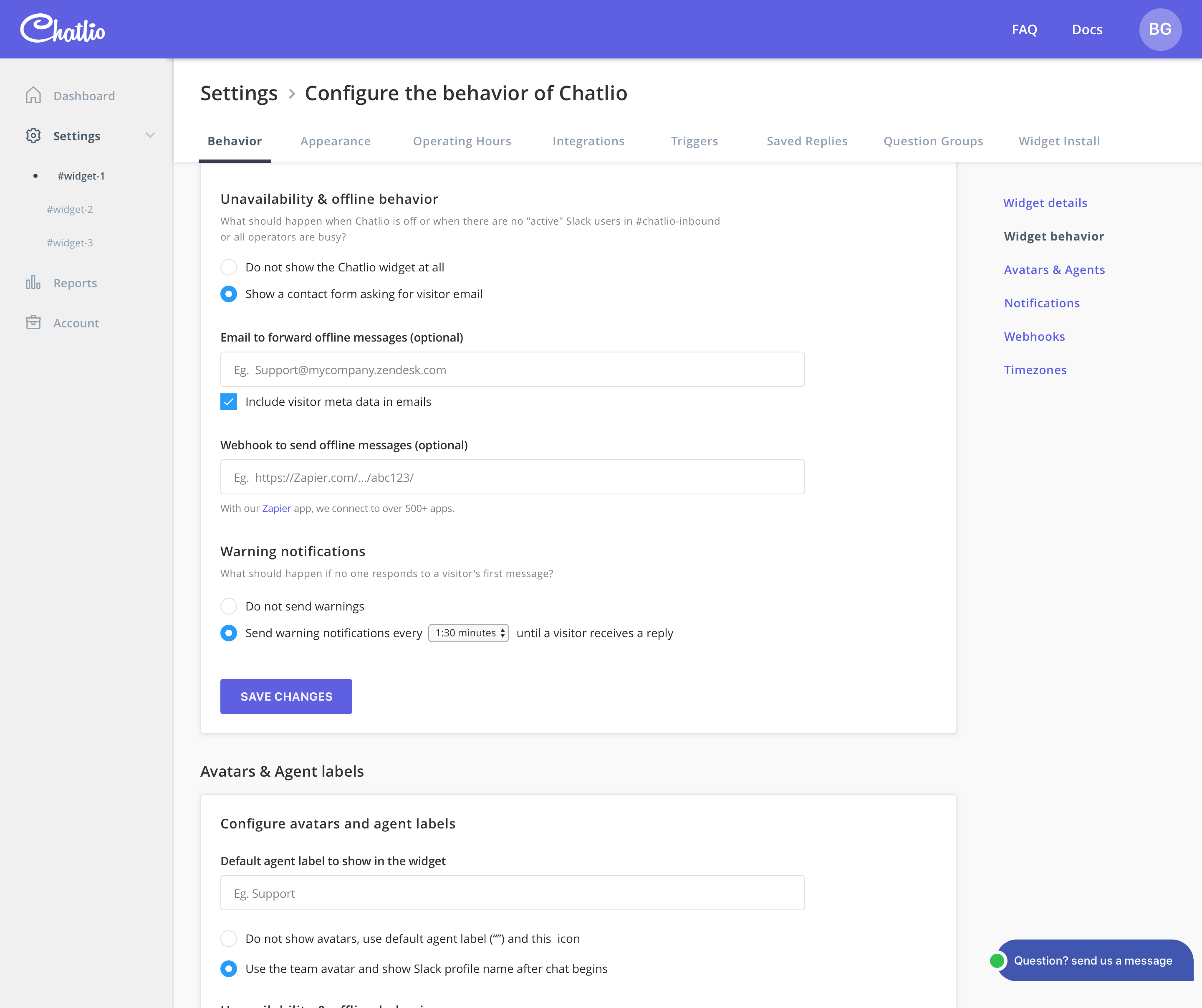
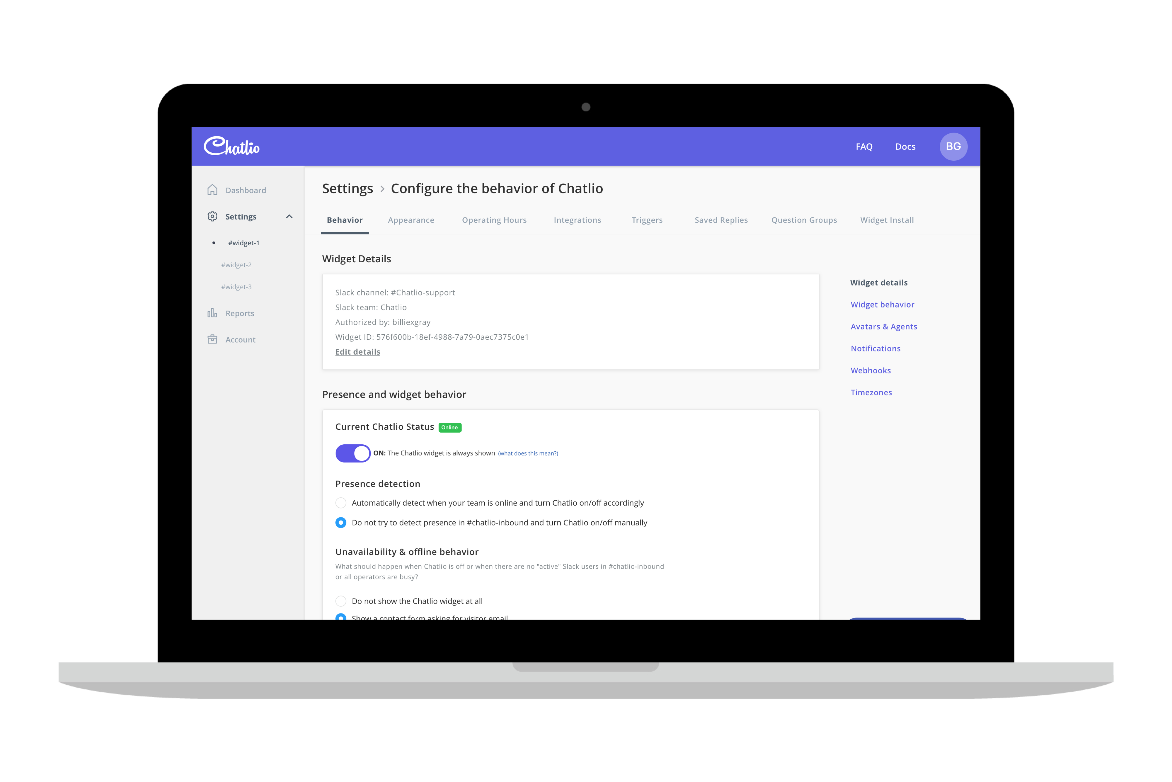
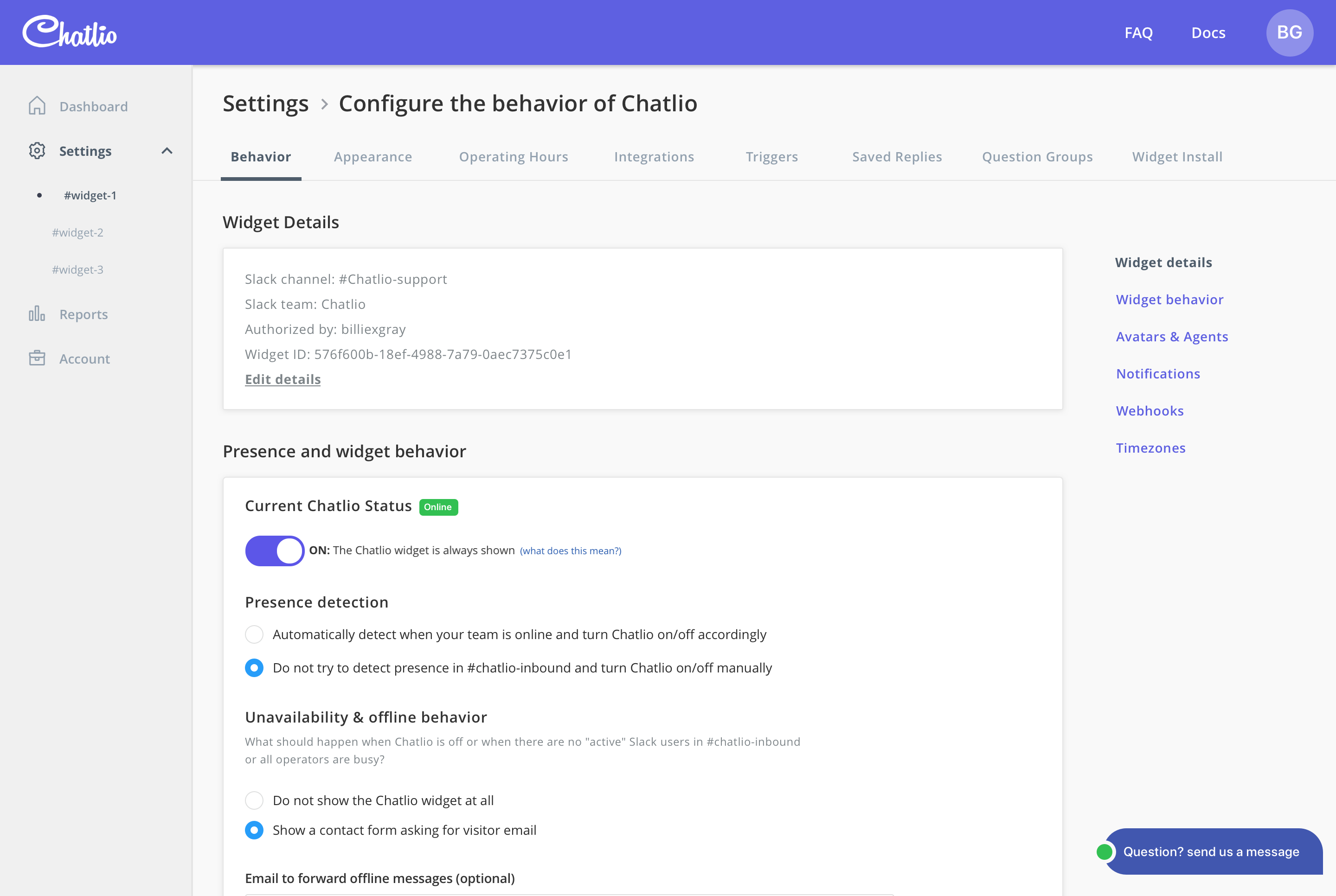
Improvements were made to typography hierarchy and colour to show active states and differentiate between setting names and help text.
Updated tabbed navigation to accommodate horizontal overflow scroll behaviour.
Introduced pannel style layout for clear grouping of related settings to improve page scan-ability.
Introduced in context saving, so users would remember to save changes and get feedback immediately.
Introduced secondary context navigation (Right-hand side) to improve navigation between settings on long pages.
An alternate top navigation was proposed to eliminate potential for
overflowing tabs and to match the navigation on the documentation and
public facing site.
Ultimately We opted to stick with the primary left navigation due to
the potential for the new pattern to confuse existing users and the
tight time frame didnt allow for additional testing.
It would have been nice to be able to include the search function, however this was cut from final implementation due to time restraints and additional development work required.
Overall the project went smoothly within the time frame and with the available resources. Feedback from users has been positive.